Table of contents
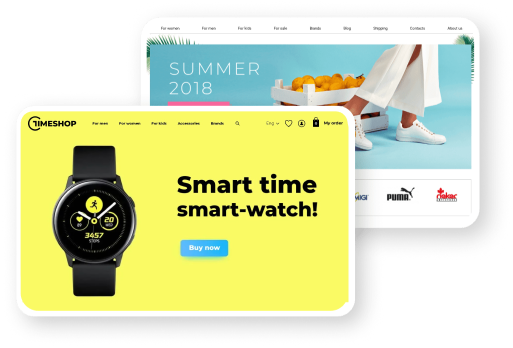
The product card is probably the most critical part of an online store's website. Studying the card is the decisive step before purchase, so every element should be perfect. This article will tell you what a product card should be like and show examples of successful solutions.
The product card is probably the most critical part of an online store's website. Studying the card is the decisive step before purchase, so every element should be perfect. This article will tell you what a product card should be like and show examples of successful solutions.
What is a product card?
A product card is a page with product descriptions, features, images, prices, buying conditions, and customer reviews. The card gives answers to all the questions about the product. The user may not even have to look at the site - he will go straight to the product page via organic search or advertising. It's essential to be sure the card informs the client, encourages him to buy, and makes it easy to place an order.
How to create a product card
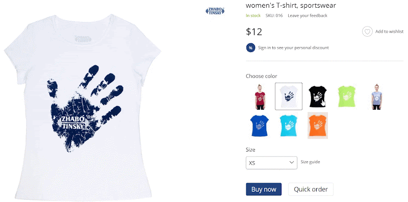
Title
The product name is the first thing that should catch the eye, so make it big. Users' eyes follow a path that resembles the letter "F", which means the best place for the name is the upper left or right corner. If the brand plays an important role, put it in the title. You can also put one of the main features that differentiate the product from its variations there, for example, the amount of memory in the phone. Even if the name turns out to be long, it is not a problem.
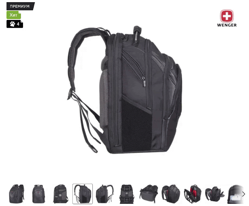
Gallery
After the name, the user pays attention to the product image. The gallery is usually placed on the left side of the page. Take care that the gallery was a few photos with a high extension. The visitor can enlarge the picture and see the details of the product from all sides. Add a video overview of the product to the gallery, if possible. The video will give a complete picture of how the product looks.
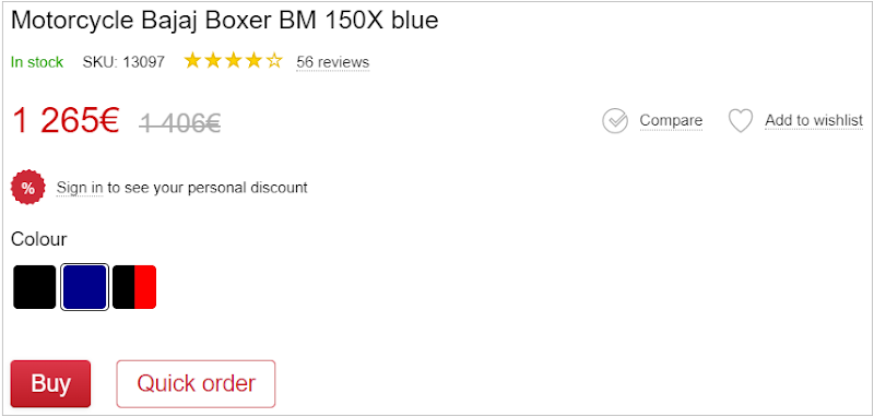
Price
Very often, the price is almost the main argument in favor of the purchase. Make the price noticeable by using a large font that is the same size as the name. If the item is discounted, highlight the price in color, and make the past price tag smaller and less noticeable.
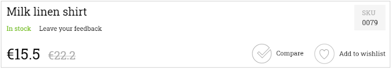
The “Buy” button
The "Buy" button is the key element of the product card and a call to action for the customer. There should be a contrast between the "Buy" button and the other page elements. Select the "Buy" button with color and size. The user will not look for the "Buy" button with their eyes but will bump into it automatically. If the page has "Quick Order" buttons, place them next to the primary one, but don't make it as contrasting.
Description and characteristics
Description and characteristics seem almost synonymous, but they are two different types of information. Characteristic is a clear list of parameters and distinctive features of the product, and the description - is a more arbitrary story about the product, its features and benefits. The product description can contain some characteristics, but the components should not be mixed up. Properly worded descriptions with SEO keys will help promote the site in organic searches.
Many people place blocks below the gallery so that after a visual acquaintance with the product, the user can proceed to a detailed study. Which of the blocks to place first - you decide. You can put them not one after the other but in different parts of the map. For example, you can add the description after the gallery and the specifications - parallel to it - on the right side of the page next to the “Buy” button.
Modifications
Often one product has several variants at once. For example, a T-shirt is sold in several colors, or shampoo has different bottle volumes. Modifications give the user a choice and keep him on the product page. If the client doesn't fit the initial product, he can probably find the right offer among the modifications. Place the variations below the price so that when you switch it, you can see how the cost and appearance of the product change.
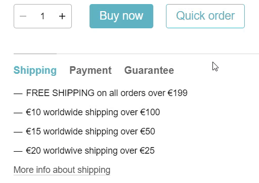
Terms of Purchase
Let the buyers know on what terms they can purchase the product. Place a block below the "Buy" button with information about delivery methods, payment, warranty and return policy. Mention your benefits. Talk about free delivery if you order from a certain amount, a good installment plan, etc. The information must be transparent and unambiguously interpreted, so the user does not face surprises. For example, immediately warn about the commission on payment.
Reviews
No order on the Internet is made without studying the reviews of the product and the store. Good reviews can finally convince you to buy, so the section with them is mandatory on the product card. Some stores place a block with reviews right after the "Buy" button or under the gallery. Unless you can put feedback in a prominent place, it will still be noticeable. The main thing is to have a customer rating at the top of the card and a clickable caption with the number of reviews. Clicking on the link will take the user to the reviews section.
"Favorites" and "Compare"
Usually "Favorites" and "Compare" buttons are placed on the same level as the price on the far right of the card. These features do not have a high priority. So the buttons should not stand out. You can not even sign them, but make them intuitive: a button in the form of a swear word for adding to favorites, an icon of scales - for comparison. The comparison function is not always needed because not all products have advanced characteristics, but "Favorites" is suitable for any store.
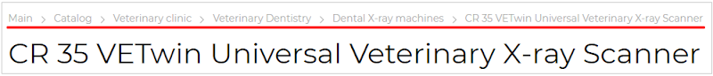
Breadcrumbs
Breadcrumbs is a navigation tool that displays the user's path to the page. Each part of the chain is clickable, allowing you to navigate quickly to the desired section. Adding breadcrumbs to a product page makes the site more user-friendly and keeps the customer engaged. Suppose a user opened a product card through an organic search. And then he wondered what kind of phones that manufacturer was selling in the store. With breadcrumbs, you don't have to go into the product catalog. It is enough to click on the corresponding item in the chain.
Product bundles
If you sell items as a bundle and the total purchase gives a discount, inform your users about it. Add a separate block to the card, saying that these items are cheaper altogether. Such an offer will be an additional incentive to buy, so put the section in a prominent place, for example, above the price. Also, in this block, you can specify the gifts the client will receive when ordering. For example, when buying a phone - headphones as a gift.
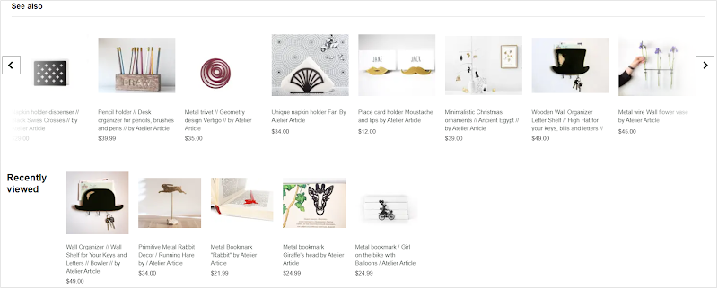
Viewed and similar products
When a user has been browsing the online store for a long time, he may lose products he likes. The block with viewed products will help to avoid this situation. It will display all product cards currently opened by the user with their thumbnails, name and price. Add this section to the bottom of the page. So it doesn't take up unnecessary space. Next to it, put a block with products similar to the one you are viewing now. This way, you'll keep the client and acquaint them with your assortment
Conclusion
A purchase decision depends a lot on the product card. Make it informative and easy to use, allowing the users to find out everything they need about the product and the purchase terms. Do not overload the page with extra elements not to lose the main emphasis, which encourages the customer to buy. We hope our tips will help you create the perfect product card.
Start your own online-store
Free test 7 days